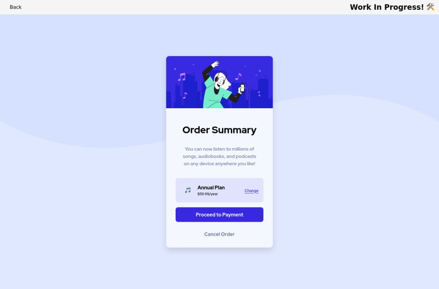
Order Summary using Solid JS, CSS Modules, Flexbox, and Grid
Design comparison
Solution retrospective
Adding and styling the click animation for the buttons was fun. It consists of three parts:
- Changing element scale on hover and click
- Setting the drop-shadow and box-shadow on hover and click
- Adding a transition for each
[Update 2023-03-05]
I updated the code for this challenge to use an h1
tag as recommended by a Frontend Mentor user.
Community feedback
- @Finney06Posted over 1 year ago
Hello there ๐. Good job on completing the challenge !
Here are some suggestions regarding your code that may be of interest to you.
HTML ๐ค:
To clear the Accessibility report:
Use an
h1
tag for the main text in the design given and always avoid skipping heading levels; Starting with<h1>
and working your way down the heading levels (<h2>
,<h3>
, etc.) helps ensure that your document has a clear and consistent hierarchy.I hope you find it helpful!๐ Above all, the solution you submitted is ๐. ๐Happy coding!
Marked as helpful1@Brian-PobPosted over 1 year ago@Finney06 Thank you for the suggestion! While I agree that heading levels should not be skipped, I decided to use an
<h2>
tag because this is an element that would likely be used as a component in a larger web page.For example, a real page might have "Shop Our Products" as their h1 and the cards would display the titles of their products.
I appreciate the feedback though! โ๏ธ
1@Finney06Posted over 1 year ago@Brian-Pob yeah, you're absolutely right but just take note that in any webpageit is best practice in HTML to start with an
h1
tag for several reasons:-
Helps with SEO: Search engines use headings to understand the structure and hierarchy of a webpage's content. The H1 tag is typically used to indicate the main topic or title of the page, which can improve the page's search engine optimization (SEO) and help it rank higher in search results.
-
Improves accessibility: Screen readers and other assistive technologies also rely on headings to navigate a webpage. Starting a page with an H1 tag can help users with disabilities more easily understand the content and structure of the page.
-
Organizes content: Properly using heading tags (such as H1, H2, H3, etc.) can make the content of a webpage easier to scan and understand. This can improve the user experience and make it more likely that users will stay on the page and engage with the content.
0 -
Please log in to post a comment
Log in with GitHubJoin our Discord community
Join thousands of Frontend Mentor community members taking the challenges, sharing resources, helping each other, and chatting about all things front-end!
Join our Discord