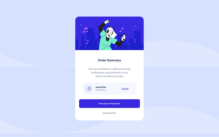
Design comparison
Solution retrospective
Hi, thanks for any and all feedback you have.
This one was a bit of a struggle after taking a break from my first one - I tried using ems, though unsure how I feel about my own implementation of them and whether they were useful or not. I used the native mac Preview app to get all of the sizes right but found it a little finicky and inexact.
I only used Flexbox for the annual plan section, though I'm wondering if there might be an easier way to lay out elements in a row with custom positioning. Actually, now that I say positioning, I'm wondering if I should've used it rather than padding to push elements away from each other. Hm!
All in all, a fun exercise and I'm trying out new things and trying to find the perfect workflow for me.
Please let me know what you'd streamline/do differently or more efficiently and what aspects you think I should work on.
Community feedback
Please log in to post a comment
Log in with GitHubJoin our Discord community
Join thousands of Frontend Mentor community members taking the challenges, sharing resources, helping each other, and chatting about all things front-end!
Join our Discord
