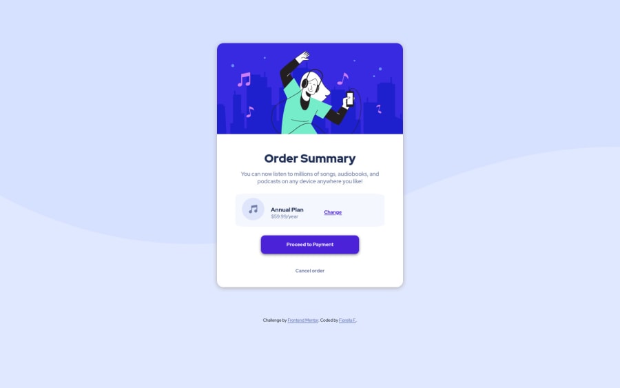
Design comparison
Solution retrospective
I only figured out how to make it look like the design when opening the page on a desktop screen. Could someone tell me how to make it look good on mobile and desktop? Its the next thing I'm gonna be focusing my learning on :)
Community feedback
- @joewild90Posted over 1 year ago
Hey Fiorella, congratulations on finishing the challenge :-) Considering the mobile-first approach I would set the initial max-width to something like 95% or 90%. Then you could use a media-query for bigger viewports to switch to a fixed max-width of e.g. 350px.
.container1 { max-width: 90%; } @media screen and (min-width: 400px) { .container1 { max-width: 350px; } }
This should solve most of the problems. Just test it out yourself and see what fits best. The next problems for the mobile view are:
- the padding of the .songs-text gets too big
- the .annual element breaks for smaller viewports (maybe use a media query to make the icon smaller ?)
Other things to keep in mind:
- Use landmarks like <main> to get rid of the accessibility error
Things to google:
- Mobile-first design/development
- Media queries
- Flexbox
- landmarks
Cheers & Happy Coding
Marked as helpful1 - @visualdennissPosted over 1 year ago
Hello Fiorella,
very nice work with the challenge. It looks good on desktop especially. However some issues for responsiveness.
It looks like the background is not matching the design, so instead of using background-size: cover; you can simply use:
- background-size: 100%;
- background-repeat: no-repeat;
Also it is better to have the bg for the body itself instead of .bg-img in this case.
Regarding width, i don't think it is necessary to give max-width: 90% or 95%, a most of the time all you need is the combo of: width: 100% and max-width: some-value (like 350px in rem/em etc.) And you can simply add padding to the container itself like 20px or 40px, so it never touches to screen whether its mobile or tablet. That is the most common practice.
- Also i'd suggest adding cursor: pointer; to the all interactive elements to indicate interactivity to the user.
Hope you find this feedback helpful!
1
Please log in to post a comment
Log in with GitHubJoin our Discord community
Join thousands of Frontend Mentor community members taking the challenges, sharing resources, helping each other, and chatting about all things front-end!
Join our Discord