Design comparison
Solution retrospective
Appreciate your feedback!
Community feedback
- @FeelshotPosted almost 3 years ago
Hello future Dev, I have found some errors that could make your exercise much better. Remember that there are no correct ways to do it, just different ways and the following is my personal recommendation :D
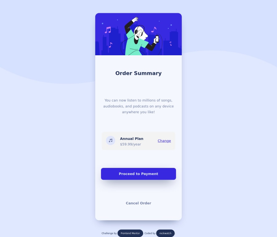
The margin and padding on your elements is not properly applied, due to how you built the main container. You make a container card to center everything, however this harms the visualization of it. Try to make a card of a fixed size and center it with
.card { display:flex; flex-direction:column; justify-content:center; Align-items: center; }
I leave you my exercise so that you can visualize how I arrive at that solution, I hope it will help you.
Github: https://github.com/Feelshot/practica-02-css Live site: https://practica-02-css.vercel.app/
Greetings and good trip mate.
Marked as helpful1@lopezolidevPosted almost 3 years ago@Feelshot Thanks! this is so helpful, I'm starting this awesome journey and I appreciate this kind of support. I value when people remark my mistakes, that's a fuel for my own improvement.
The padding was a thing that actually I had trouble working into, I just didn't see the actual problem, then of course... Thanks my mate! I'll check up your solution and learn from example, have a nice day bro!0 - @arkharman12Posted almost 3 years ago
There is so much extra spacing between content. You might want to fix that.
Marked as helpful0@lopezolidevPosted almost 3 years ago@arkharman12 You're right, this is one of my very early projects, still thanks for the advice and I'll implement it on the next challenges straightaway
0
Please log in to post a comment
Log in with GitHubJoin our Discord community
Join thousands of Frontend Mentor community members taking the challenges, sharing resources, helping each other, and chatting about all things front-end!
Join our Discord
