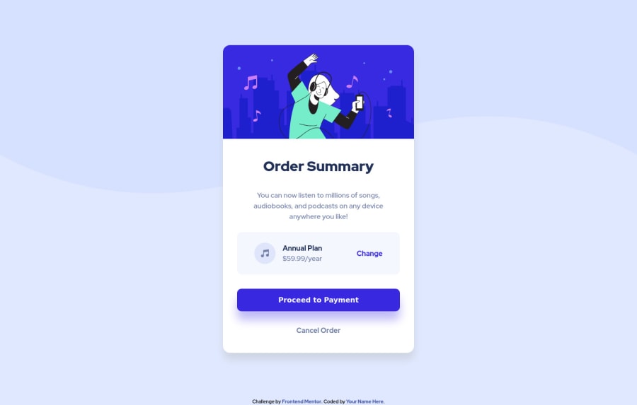
Design comparison
SolutionDesign
Solution retrospective
This was a bit more involved than expected. Especially that Annual Plan div. Also, I noticed that when I used flexbox the div would stick out of the container at times. I think I fixed but what's the best way to avoid that behavior?
Community feedback
- @vanzasetiaPosted over 2 years ago
Nice work on this challenge, Adenike! 👍 You wrap all the page content with the correct landmark elements and use the heading tags in order. Well done! 👏
There are some areas that you could improve.
- Not all images need alternative text. In this case, all images are decorative only so I would suggest leaving the
alt=""empty and addingaria-hidden="true"to prevent the VoiceOver screenreader pronounce the emptyaltimages. - Always specify the
typeof thebutton. In this case, set the type of them astype="button". It's going to prevent the button from behaving unexpectedly (like submitting). - Always use a meaningful element to wrap text content. I notice that the
attributiontext is wrapped by adiv.
I hope you find this information useful! Keep up the fantastic work! 👍
1 - Not all images need alternative text. In this case, all images are decorative only so I would suggest leaving the
Please log in to post a comment
Log in with GitHubJoin our Discord community
Join thousands of Frontend Mentor community members taking the challenges, sharing resources, helping each other, and chatting about all things front-end!
Join our Discord
