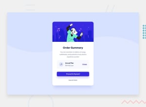
Design comparison
Solution retrospective
When it shows the design comparison, my app kind of looks like it fell apart but on my site everything looks fine, why is this? Otherwise, I think I was able to do this pretty well, but I didn't completely do the background and I definitely struggled on the container that has the music logo and the annual plan. Any tips for a more efficient way to build that part. Also, I'm not sure if the "Proceed to Payment" button was suppose to be a link but I just have it as a button. Also don't have a complete understanding of how my method of centering the app worked using flexbox. Anyways, any thing I should improve on and could have done better
Community feedback
- @dinahbritoPosted almost 3 years ago
Proceed to payment is a button, so that’s good! I think you could’ve simplified the Annual plan block, by adding padding to all sides of the Annual Plan div which would force the elements inside to center within that div. That way you don’t have to add margins or padding to the elements inside. It’s kind of like creating a really thick invisible border around the elements inside the div.
Feedback:
-
The background image is an svg file that is partially transparent. So it just needs a different background color added to the body of the page to match the design.
-
The background color is also missing from the main section which is the container for the card.
-
There should be an H1 tag, probably around Order Summary as it’s the title of the card
-
If you change the attribute div to footer, it’ll get rid of one of the accessibility issues. Footer is basically a semantic name for a div and it makes sense to use since it’s at the bottom of your page.
-
It’s awesome you’re using custom properties, but maybe simplify it a bit? Anything that you don’t actually use shouldn’t be there.
-
Same with the heading tags in CSS, if you’re not using it in your HTML, its not necessary to style it.
I’m not really sure what problems you’re having with Flex Box, but so far it seems to be working? The only thing that might be a problem is that you might be repeating yourself unnecessarily. Like it might be easier to have a container div holding all the content under the image. Add padding so that they’re lined up on the sides. Then you wouldn’t have to center elements individually. I hope that helps and good luck!
Marked as helpful0@ljcuttsPosted almost 3 years ago@dinahbrito Thank you so much for the feedback! Still haven't mastered the right html elements to use in the proper situations and I did feel myself using redundant code. This helps a lot!
0 -
Please log in to post a comment
Log in with GitHubJoin our Discord community
Join thousands of Frontend Mentor community members taking the challenges, sharing resources, helping each other, and chatting about all things front-end!
Join our Discord
