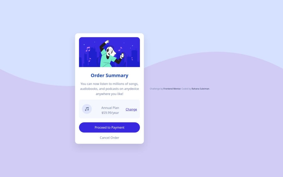
Design comparison
Solution retrospective
Am most proud of completing this project without any problems.
What challenges did you encounter, and how did you overcome them?I accidentally made my Github repository private and couldn’t submit the project on time, so i deleted that one and created a new repo.
What specific areas of your project would you like help with?Any suggestions on how to improve are welcomed
Community feedback
- @Grimm-NPosted 5 months ago
Your work looks fantastic—seriously, you're doing amazing! 👏 The effort shows, and the design is coming together beautifully. Just a few friendly tips to keep the magic going:
-
The inline styles in the HTML? Feel free to delete those—they’re just there as placeholders to guide you.
-
Pixels are like the OG units, but consider using
em,rem, or percentages instead. They’re more scalable and make your design friendlier on devices of all sizes. Trust me, your layout will thank you! -
To get the footer below the card, add this to your flex container:
.container {
    display: flex;
    flex-direction: column;
}
Or, if the footer isn’t really needed, you can just remove it—it’s just a placeholder too!
-
If your image has weird padding, here’s a quick fix: put it in its own container. This way, it won’t inherit padding or styles from other elements. Something like:
<div class="image-container">
    <img src="your-image.jpg" alt="Cool image" />
</div>
Keep crushing it—your project is seriously impressive! 🚀
Marked as helpful1@Rahana23Posted 5 months ago@Grimm-N Noted and will apply all these on my next project thank you
0@Grimm-NPosted 5 months ago@Rahana23, Always happy to help! That's the beauty of this platform—we help each other learn. 😊
Marked as helpful0 -
Please log in to post a comment
Log in with GitHubJoin our Discord community
Join thousands of Frontend Mentor community members taking the challenges, sharing resources, helping each other, and chatting about all things front-end!
Join our Discord
