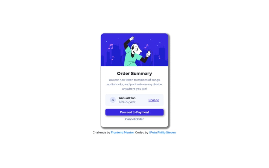
Design comparison
SolutionDesign
Solution retrospective
I think I don't have any problem designing this page, feel free to tell me what can I improve
Community feedback
- @0xabdulkhaliqPosted over 1 year ago
Hello there 👋. Congratulations on successfully completing the challenge! 🎉
- I have other recommendations regarding your code that I believe will be of great interest to you.
CSS 🎨:
- let me explain, How you can easily apply the
background colorwith thesvgthey provided.
- Add the following style rule to your css, and then experience the changes
body { background: url(/pattern-background-desktop.svg), #E1E9Ff; background-repeat: no-repeat, no-repeat; }- Tip, Don't forget to generate a new screenshot after editing the
cssfile
HTML 🏷️:
- This solution generates accessibility error reports, "All page content should be contained by landmarks" is due to incorrect usage of
semanticmarkup, which causes lacking of landmark for a webpage
- So fix it by replacing the element
<section class="attribution">the with semantic element<footer>in yourindex.htmlfile to improve accessibility and organization of your page.
- What is meant by landmark ?, They used to define major sections of your page instead of relying on generic elements like
<div>or<span>
- They convey the structure of your page. For example, The
<footer>typically contains information about the author of the section, copyright data or links to related documents.
.
I hope you find this helpful 😄 Above all, the solution you submitted is great !
Happy coding!
0
Please log in to post a comment
Log in with GitHubJoin our Discord community
Join thousands of Frontend Mentor community members taking the challenges, sharing resources, helping each other, and chatting about all things front-end!
Join our Discord
