Design comparison
SolutionDesign
Solution retrospective
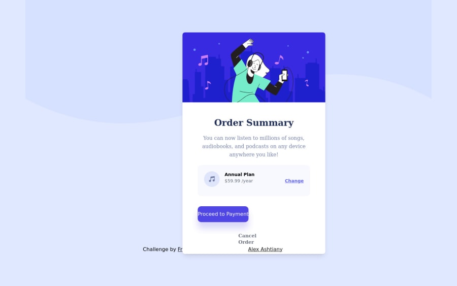
This project was fairly easy, except the background overlay.
Community feedback
- @MelvinAguilarPosted about 2 years ago
Hi @AlexDevOp4 👋, good job on completing this challenge! 🎉
Here are some suggestions you might consider:
- You could use the CSS backgrounds properties to set the background:
body {
  background-color:  hsl(225deg, 100%, 94%);
  background-image: url(./images/pattern-background-desktop.svg);
  background-repeat: no-repeat;
  background-size: contain;
  background-position: left top;
}
The background property is shorthand for all the properties mentioned above:
background: hsl(225deg, 100%, 94%) url(./images/pattern-background-desktop.svg) no-repeat left top/contain;References:
.
- Centering the element with position would make your element behave strangely on some mobile devices.There are two modern CSS techniques to center elements instead of using the position property:
Using flexbox layout:
body {
   width: 100%;
   min-height: 100vh;
   display: flex;
   flex-direction: column;
   justify-content: center;
   align-items: center;
}
Using grid layout:
body {
   width: 100%;
   min-height: 100vh;
   display: grid;
   place-content: center;
}
Links with more information:
- The Complete Guide to Centering in CSS.
- A Complete Guide to Flexbox (CSS-Tricks).
- How TO - Center Elements Vertically (W3Schools).
- CSS Layout - Horizontal & Vertical Align (W3Schools).
I hope those tips will help you.
Good job, and happy coding!
Marked as helpful2
Please log in to post a comment
Log in with GitHubJoin our Discord community
Join thousands of Frontend Mentor community members taking the challenges, sharing resources, helping each other, and chatting about all things front-end!
Join our Discord
