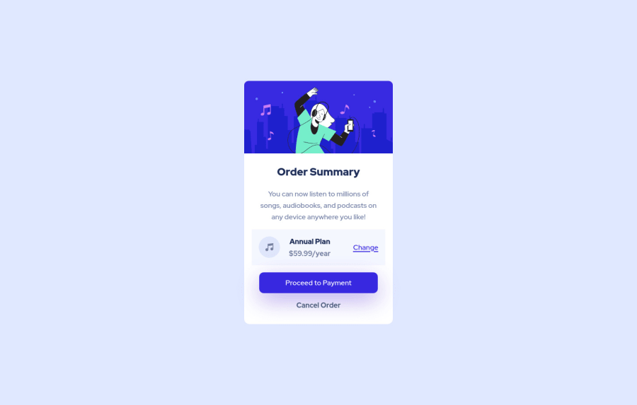
Design comparison
Solution retrospective
Feel free to leave any suggestion
Community feedback
- @KenisaReneePosted over 2 years ago
Hi Luciano! Excellent work on finishing this solution.
Two things to consider if you'd like to bring this a little closer to the original design.
-
A
box-shadowcan be added to your<main>component. The exact code I personally used on this project wasbox-shadow: 0 25px 30px rgba(201, 201, 240, 0.7);but you can learn more about them from W3 Schools and come up with something of your own if you prefer. -
The background wave can be structured by adding the following to the body.
background-image: url("./images/pattern-background-desktop.svg"); background-position: top; background-repeat: no-repeat;
You're doing great and happy coding!
Marked as helpful1 -
Please log in to post a comment
Log in with GitHubJoin our Discord community
Join thousands of Frontend Mentor community members taking the challenges, sharing resources, helping each other, and chatting about all things front-end!
Join our Discord
