Design comparison
Solution retrospective
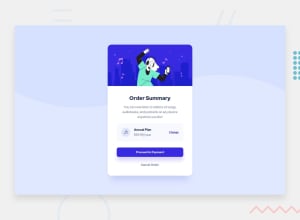
This is actually my second attempt at this project. I didn't understand about posting it here instead of the slack page. I think it's pretty close to what it's supposed to look like, but I had some difficulty trying to figure out how to make the music icon round and darker amoung other things. Please look at the code and tell me how to make it cleaner if need be.
Community feedback
- @emmanuelkumahPosted over 2 years ago
Hi, nice try. Concerning the music icon, give the <img/> tag a class, specify the background color, and to make it rounded, set the border-radius to 50%. Example .musicIcon { background-color: blue, border-radius: 50% } Also try using semantic HTML, instead of mainly using div, you can use <main> tag to wrap all the main elements and wrap each portion of the design in a <section></section> tag.
Happy Coding
Marked as helpful0 - @shashreesamuelPosted over 2 years ago
Hey good job completing this challenge.
Keep up the good work
Your solution looks good however I think the content within your card needs some padding around.
Secondly the background color of the area where you see the plan should match the color specified in the
style-guide.mdfileIn terms of your accessibility issues simply wrap all your content between
maintags. I hope this helpsCheers Happy coding 👍
Marked as helpful0@JohnRocco1Posted over 2 years ago@TheCoderGuru Thanks for your comment. I had difficulty with the colors because it's hard for me to determine the colors in the example. Other than what you pointed out, is there any other commentary on my coding? Mostly I'd like to know if it could have been clearer.
0
Please log in to post a comment
Log in with GitHubJoin our Discord community
Join thousands of Frontend Mentor community members taking the challenges, sharing resources, helping each other, and chatting about all things front-end!
Join our Discord
