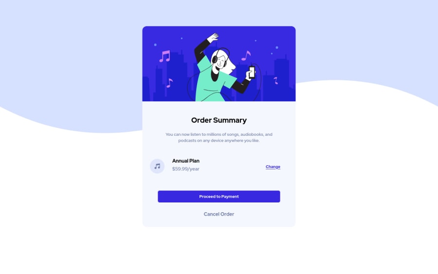
Design comparison
Solution retrospective
Hey! 's up. This is my solution for this challenge and if you have any advice, so i can improve, i'm open to all suggestion! Thank you and see ya.
Community feedback
- @NaveenGumastePosted almost 3 years ago
Hay ! samyak Good Job on challenge
These below mentioned tricks will help you remove any Accessibility Issues
-> Add Main tag after body
<main class="container"></main>
-> Learn more on accessibility issues
If this comment helps you then pls mark it as helpful!
Have a good day and keep coding 👍!
Marked as helpful0@samyak317Posted almost 3 years ago@Crazimonk Thanks for suggestion, will look after it
1 - @ChamuMutezvaPosted almost 3 years ago
- the first heading element of a site should be an h1, that is the best practice as it is considered beneficial to assistive technology users.
- heading elements must follow a sequential order, without skipping. H1, h2, h3, in that order.
- alt values should be descriptive for the benefit of assistive technology users. Decorative images should have empty alt values
Marked as helpful0@samyak317Posted almost 3 years ago@ChamuMutezva Thanks for suggestion, will take care of it
0 - Account deleted
Hello there! 👋
Congratulations on finishing your challenge! 🎉
I have some feedback on this solution:
-
Always Use Semantic HTML instead of
div
like<main>
<header>
, etc for more info -
add to the body
background-color:#e0e8ff
if my solution has helped you do not forget to mark this as helpful!
0 -
Please log in to post a comment
Log in with GitHubJoin our Discord community
Join thousands of Frontend Mentor community members taking the challenges, sharing resources, helping each other, and chatting about all things front-end!
Join our Discord