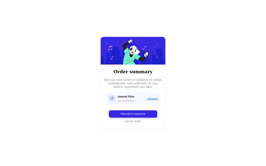
Design comparison
Solution retrospective
this was a great test that made me search about many things. I learned a lot from it. I know I'm not professionally completed it but it's an achievement for 3 days of learning HTML and CSS, I'm willing to solve more examples and expand my skills
Community feedback
- @RMK-creativePosted about 3 years ago
Hi Mohamed,
Congratulations on completing your first challenge, and after only 3 days of learning? I’m super impressed! Well done!
I’ll just point out a couple of things:
When using multiple heading tags, they must be in numerical order from 1 - 6, so we can’t have a <h2> tag and then skip to <h4> for example. You can read more about them here: https://developer.mozilla.org/en-US/docs/Web/HTML/Element/Heading_Elements If you check out the report it will also have some great info on how to improve the semantics.
The other tip is that you can use google fonts easily to match the design. Here’s some info on how to use it: https://developers.google.com/fonts/docs/getting_started You will find the font name that you need for this project in the design file.
You’re off to great start - keep going! 😊
1 - @darryncodesPosted about 3 years ago
Hi Mohamed,
Great solution, almost an exact match!
I can't seem to see the background image and styles, have a think about adding this to your body styles:
background-image: url(../images/pattern-background-desktop.svg);
background-size: 100% auto;
background-repeat: no-repeat;
background-color: hsl(225, 100%, 94%);
0
Please log in to post a comment
Log in with GitHubJoin our Discord community
Join thousands of Frontend Mentor community members taking the challenges, sharing resources, helping each other, and chatting about all things front-end!
Join our Discord
