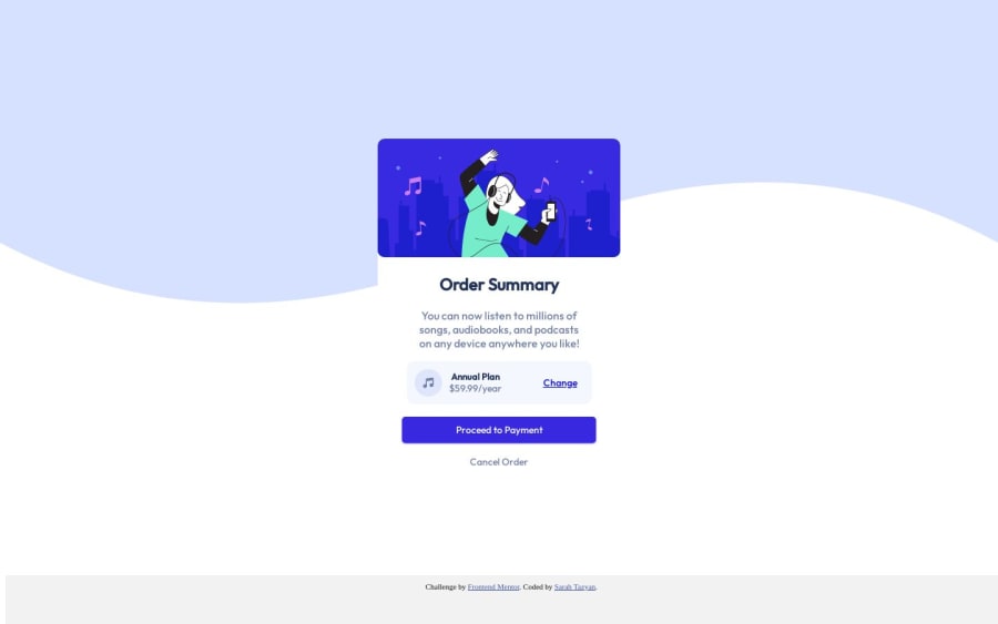
Design comparison
Solution retrospective
How can I add the shadow on the button with the exact color and design that is shown in the preview? Thank You
Community feedback
- P@atif-devPosted over 1 year ago
Hi, congrats🎉 on complleting the challenge. Better take care about following points:
- For better look on larger screens modify code as:
body { background-image: url("images/pattern-background-desktop.svg"); background-repeat: no-repeat; background-size: 100%; background-color: hsl(225, 100%, 94%); }- For button shadow add
box-shadow: 0px 18px 17px 0px #DFDCF9;inbuttonselector instead ofbox-shadow: 0 1px 2px rgba(0, 0, 255, 0.5); - When we open GitHub repository link, at right side you will find an About Section. There, also include live preview link of your project. It is better for someone to check your live project while interacting with code.
- In README file of your GitHub project's solution: write about your working flow, findings, new learned things, useful resources, etc.
Hope you will find this Feedback Helpful.
Let's connect for learning📝 and sharing🤝. Twitter , LinkedIn
Marked as helpful0 - @adityaphasuPosted over 1 year ago
Hello, @sarahtazyan!
- Firstly to get that background bluish color like in the design it can be achieved using
background-colorproperty on the body like this:
body{ background-color: hsl(225, 100%, 94%); }- For the box shadow on the button I tried some values in the devtools and this is what I found to be closer to design:
box-shadow: 0 4px 13px rgb(64 64 242 / 50%);Some suggestions to improve the code:
- Instead of using
absoluteposition to center the card you can use flex properties on the body instead like this:
body { min-height: 100vh; display: flex; justify-content: center; align-items: center; //rest of the styles }- This will center the card in the middle of the page and you can remove:
.box-container {
    position: absolute;
    top: 50%;
    left: 50%;
    transform: translate(-50%, -50%);
}
from the
.box-container.Keep up the hard work and good luck!
Marked as helpful0 - Firstly to get that background bluish color like in the design it can be achieved using
Please log in to post a comment
Log in with GitHubJoin our Discord community
Join thousands of Frontend Mentor community members taking the challenges, sharing resources, helping each other, and chatting about all things front-end!
Join our Discord
