Design comparison
Solution retrospective
Any feedback will be appreciated
Community feedback
- @techantherePosted almost 3 years ago
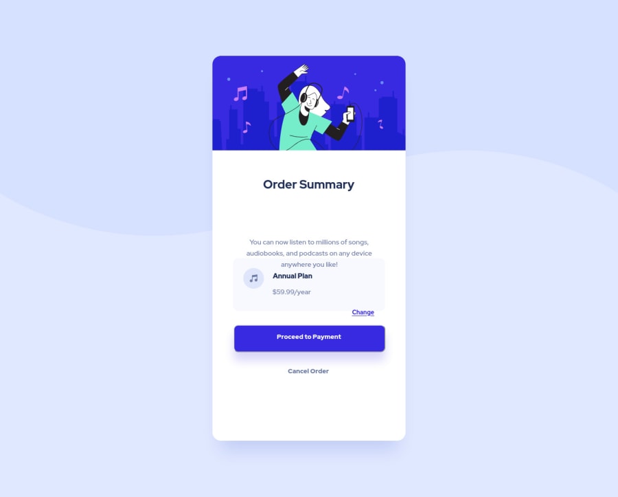
Congratulations on completing another challenge! Few things I will like to highlight for help, you are almost overusing the heights and widths and then those too with the viewport units which is not ideal for every container. You should rather set
min-height:100vh;in the body selector, and that's all you need. Other than that I don't understand why are you using fixed widths and heights everywhere, like using height:70vh; inside for middle_div is redundant. Your solution is breaking on widths higher than 480px. I think you don't need to set any media queries for this solution. Just set some max-width on .main, some padding in body selector and you are good to go.For html structure, span is not required inside the button instead you can directly style button text. Span is mostly used for applying different styles to a small text within the same paragraph, heading or button if there is some text different from the whole text inside the button. You should use anchor tag <a> or button for "change" option and same holds for others like cancel etc.
Hope it helps!
Marked as helpful1@cansurer-atPosted almost 3 years ago@techanthere Hi Haine,
Thanks for your detailed comments. All suggestions take me one step further especially HTML structure tricks. I removed all queries as you suggested and remake it. What do you think about my new revision?
0 - @grace-snowPosted almost 3 years ago
Hi
I’m afraid I recommend starting this one again. Remove all the css you have, push fresh to the same repo for a clean break rather than trying to fix this as there is little recommended to keep (sorry to bring bad news)
Here are tips for improvement
- think through html semantics carefully. Images don’t have to be wrapped in divs, they can be set to display block directly (very common in css resets)
- pattern can be background image on the body, no need for a div
- use headings and paragraphs. Never have text in a span or div alone
- as already said above, no need for spans inside buttons that only hold text
- think about whether each interactive element should be a button or an anchor tag. Anchor tags would trigger navigation, buttons would trigger an action (like toggling content or submitting a form)
- put the images inside the card in the html rather than using background img in div, I think you’ll find that easier
- remove all heights and widths from everything. The only places you’ll need a min-height is 100vh on the wrapper element to vertically center your component on the page; maybe a min or max height on the image at the top of the card (probably not necessary if it’s set to width 100%); and an explicit height and width on the decorative music icons. Icons are probably the only place I’d regularly recommend giving exact heights and widths. Most of the time, you won’t need them.
- use padding on the proceed to make it look tall enough. On that it could be in em or rem.
- for paddings and margins don’t use viewport units, use rem. Viewport units should only be used sparingly for very specific purposes. This has caused most of the breakage in your solution I think
I hope this is helpful
Marked as helpful0@cansurer-atPosted almost 3 years ago@grace-snow Hi Grace, I implemented your all suggestion and I believe that they improve me a lot. I guess I made a better solution this time. If you take a look, you will make my day again :)
0@grace-snowPosted almost 3 years ago@cansurer-at I still don’t think you’re quite understanding the importance of the right html elements.
There should only be one h1 on a page. And when there are needs in a design to have headings they must go in order. Heading structure is the most important part of structuring any document.
Did you look up the difference between buttons and anchor tags? Why do you think change is an anchor and proceed a button - I’m curious. You may have a good reason, but I’m not sure.
Related - don’t you think cancel would be clickable? Then why would it be a heading element? What. Content is that a heading for?
On the styling there’s one big issue outstanding. The content is overflowing off my screen on mobile. I think this will be due to content having side margins when they shouldn’t have it. The card content only needs some padding, then elements within it need vertical margin to create space between them.
Other important css point is never have font size in px, always use a responsive unit, ideally rem.
I hope this helps. Definitely a huge improvement on before but not there yet
0 - @cansurer-atPosted almost 3 years ago
Hi Grace, Html fixed, I was using them randomly but now, I made some upgrades. I used the anchor tag by Hania B's advice. But I changed it with a button element now. I also corrected the cancel element. I mostly changed the margin and paddings. For horizontal things, I used margin. For vertical things, I used padding. All font-size's were changed with rem instead of px. Added an active page with the hover method.
All advice's helped a lot and has a big improvement to me.
Regards
0
Please log in to post a comment
Log in with GitHubJoin our Discord community
Join thousands of Frontend Mentor community members taking the challenges, sharing resources, helping each other, and chatting about all things front-end!
Join our Discord
