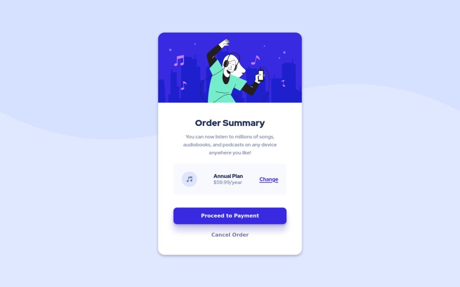
Design comparison
Solution retrospective
Hey!
I would love to hear recommendations. This is very first submit and project i completed from design and implement in React and Styled Components.
Thanks Best Arda
Community feedback
- @grace-snowPosted about 3 years ago
Interesting that you’ve chosen to build such a tiny challenge in React, I guess that’s just what you’re practicing?
This doesn’t fit on my phone screen at the moment and is missing a lot of foundational skills in the css and html semantics to be honest. I recommend you revisit those skills in a vanilla project to really nail them.
For example
- why is change an anchor tag but proceed a button? What do you expect to happen?
- when to use padding vs margin
- appropriate units for font size, line height and other things.
- when and how to use the alt attribute
They are all small things but really important code quality signals that I’d expect to see at the level of anyone using a framework like React.
I hope these ideas help and then you can keep going with the React stuff as it looks well on the way overall. Just don’t let the foundations of accessible clean html and css code fall down when learning frameworks
Marked as helpful2@to-arda-kurtPosted about 3 years agoThank you so much for such an amazing feedback @grace-snow.
I really noted your recommendations and i will take this challenge in the near future with your ideas. I think i made it hard for me to choose styled components that really new to me.
Hope you check the new version of this near future.
See you soon!
0
Please log in to post a comment
Log in with GitHubJoin our Discord community
Join thousands of Frontend Mentor community members taking the challenges, sharing resources, helping each other, and chatting about all things front-end!
Join our Discord