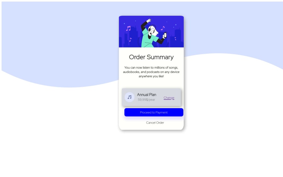
Design comparison
Solution retrospective
This is my first project with css and html, I am a complete beginner. Please leave some comments and let me know what I could have done better
Community feedback
- @cessnar516Posted about 3 years ago
Congratulations on completing your first project! Here are a few things that will help with your accessibility:
- Make sure you use heading's sequentially. Right now "Order Summary" is an
<h1>, so "Annual Plan" should be an<h2>instead of an<h3>, and the price should be an<h3>instead of an<h4>if you want it to be a heading. Personally, I would suggest changing the price to a<p>since it doesn't define a section of information on the page. - Try to incorporate semantic HTML elements to define the structure of the page. For example, you need a
<main>to define the main region of the page - I suggest adding it directly after the<body>element and having it contain everything except the footer. Then, place the footer information in a<footer>element to define that region as well. The semantic HTML element help explain the markup of the page to individuals who use assistive technology, so they're very important. - If an image is decorative (I would say all three of the images in this layout are), set the alternative text to empty quotes:
alt="". This will let a screen reader know that they can skip over the image because it doesn't provide any important information. Otherwise, the screen reader will read "no picture" or "illustration" when it gets to the images, and that can be confusing.
And here are a few suggestions for your layout:
- instead of creating a
<div>element to contain the background image, you can add the background image directly to the<html>or<body>element by using something likebody { background-image: url("css/background.svg");}. Just make sure the url text is the path that points to your image. And then you can also add abackground-colorproperty with the pale blue color to get the layered background shown in the design images. - I would also explore using percentage widths for your links at the bottom of the card and using margin/padding to position it instead of using relative positioning. The relative positioning causes your layout to break when the browser window is resized.
- Try adding a link to
<head>in yourindex.htmlfile for the Google font stylesheet specified in the style guide to get your fonts to match the example.
Hope this helps!
Marked as helpful1 - Make sure you use heading's sequentially. Right now "Order Summary" is an
- @FluffyKasPosted about 3 years ago
Hey,
-
Your background image could be applied to the
bodywith css, this would be the easiest way. -
You don't need to use IDs in this challenge (and I'd actually discourage you), plain old classes will do the job!
-
There's no need to set a
heighton your card, its height will come naturally form the elements inside it and from margin, padding, etc. -
Use
max-widthinstead ofwidththat will get rid of some problems.
Marked as helpful0 -
- @ThanhVuong0904Posted about 3 years ago
Hi!
- You should reset css
- { margin: 0; padding: 0; box-sizing: boder-box }
- use background container instead of <img>
Marked as helpful0
Please log in to post a comment
Log in with GitHubJoin our Discord community
Join thousands of Frontend Mentor community members taking the challenges, sharing resources, helping each other, and chatting about all things front-end!
Join our Discord
