Design comparison
SolutionDesign
Solution retrospective
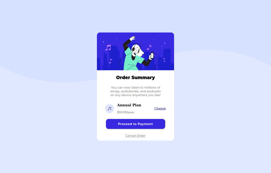
I designed this using flexbox, would using grid be a better choice here ? I think I overused flexbox here.
Community feedback
- @Biggboss7Posted over 2 years ago
Great job @BismeetSingh on accomplishing this project. You can try to implement --> background-size : contain;, so that the background will be more resemble to the original design.
Hope it helpful and happy coding
Marked as helpful1@BismeetSinghPosted over 2 years ago@Biggboss7 Thanks, I wasnt aware of that , i was trying to use cover and it was fitting the whole page.
1
Please log in to post a comment
Log in with GitHubJoin our Discord community
Join thousands of Frontend Mentor community members taking the challenges, sharing resources, helping each other, and chatting about all things front-end!
Join our Discord
