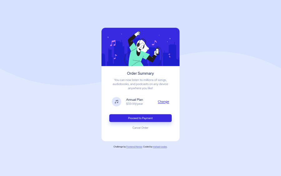
Design comparison
Solution retrospective
What do you think of the click animations? I did them with css and I'd like a feedback as to how it can be improved if need be.
Community feedback
- @AdrianoEscarabotePosted almost 2 years ago
Hi Mishael, how are you? I really liked the result of your project, but I have some tips that I think you will enjoy:
To prevent the background image from breaking at higher resolutions, we can prevent this in two different ways:
-
Add a
background-repeat: repeat-x;, the image will repeat on the horizontal axis, preventing it from breaking. -
Add a
background-size: 100% 50vmin;, the50vminwill set its height as the page target, and100%will make it stretch on the horizontal axis.
Feel free to choose one of the two!
The rest is great!
I hope it helps... 👍
Marked as helpful1 -
- @denieldenPosted almost 2 years ago
Hello Mishael, You have done a good work! 😁
Some little tips to improve your code:
- To fix the top image in the background just put more specific background properties to the body:
background: url("../img/pattern-background-desktop.svg") no-repeat top center; background-size: contain; background-color: #e0e8ff;- use
min-height: 100vhto body instead ofheight, otherwise the content is cut off when the browser height is less than the content - instead of using
pxuse relative units of measurement likerem-> read here
Keep learning how to code with your amazing solutions to challenges.
Hope this help 😉 and Happy coding!
1@denieldenPosted almost 2 years ago@mishael-codes you are welcome and keep it up :)
1
Please log in to post a comment
Log in with GitHubJoin our Discord community
Join thousands of Frontend Mentor community members taking the challenges, sharing resources, helping each other, and chatting about all things front-end!
Join our Discord
