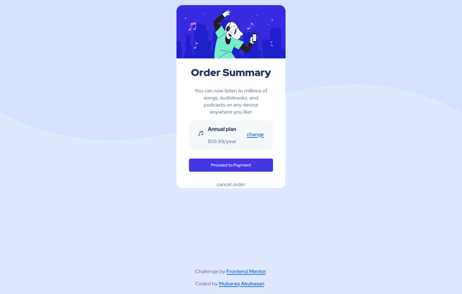
Design comparison
Solution retrospective
didn't really understand why the SVG background is different. And closing space between two block elements. And how can i make the main element stay centered?
Please log in to post a comment
Log in with GitHubCommunity feedback
- @akshaywebster
Hi, Mubaraq.
To answer your question on how to make the background svg work as the design file, here our some tips:
First of all, your background svg shouldn't repeat itself. So you'll have to write
background-repeat: no-repeat;. And then, you want your background svg to be fully visible but not stretched in any direction at all.So,
background-size: contain;will do the trick for you.Finally, you need to provide a background color that will fill up your bottom half of the background, so
background-color: hsl(225, 100%, 94%);will set the background color for you.Hope my feedback is helpful!
Marked as helpful - @ohsite
Hi there, If you want to center main element: get rid of the
<section>tag, it doesn't do anything. Also if you have attribution div, just make itfooter class="attribution". Style your body element to be a flex container and give it a height, like so:body { height: 100vh; display: flex; justify-content: center; align-content: center; position: relative; }This way your body is a flex container with 2 children, main div and also footer element with the class of attribution. We gave it position relative, so now you cant give the footer position absolute which takes it out of the DOM, and you are left with perfectly centered main element.
As for the footer do bottom: 0; left 50% + transformX and you are good to go. If you have any questions feel free to ask. Also look my solution if you want to see the code, Keep up the good work!
- @muubaraq
Thank you for this 😊
Join our Discord community
Join thousands of Frontend Mentor community members taking the challenges, sharing resources, helping each other, and chatting about all things front-end!
Join our Discord
