

Design comparison

Solution retrospective
ok
What challenges did you encounter, and how did you overcome them?ok
What specific areas of your project would you like help with?ok
Please log in to post a comment
Log in with GitHubCommunity feedback
- P@Islandstone89
HTML:
-
Every webpage needs a
<main>that wraps all of the content, except for<header>andfooter>. This is vital for accessibility, as it helps screen readers identify a page's "main" section. Wrap everything in a<main>element. -
Replace the ids with classes. This article explains the use cases for the
idattribute. -
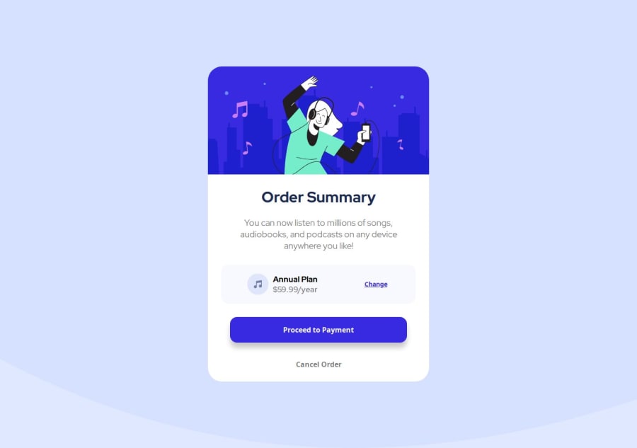
I would change the "Order Summary" heading to a
<h2>- a page should only have one<h1>, reserved for the main heading. As this is a card heading, it would likely not be the main heading on a page with several components. -
"Change" would likely navigate somewhere, hence it should be a link, not a button.
-
"$59.99/year" is a
<p>, not a heading.
CSS:
-
Including a CSS Reset at the top is good practice.
-
I like to add
1remofpaddingon thebody, to ensure the component doesn't touch the edges on small screens. -
Remove
display: blockon.container- it is a<div>which by default is a block element. -
Remove the margin on
.container. -
To center the card horizontally and vertically, use Flexbox on the body:
display: flex; flex-direction: column; justify-content: center; align-items: center; min-height: 100svh;-
Remove all widths in
px. -
Add
width: 100%on the "Proceed" button, and give it some margin so it doesn't stretch across the whole card:margin-inline: 30px;. -
Add a
max-widthof around40remon the card, to prevent it from getting too wide on larger screens. -
Instead of
border: none, it is recommended to useborder: transparent. -
font-sizemust never be in px. This is a big accessibility issue, as it prevents the font size from scaling with the user's default setting in the browser. Use rem instead. -
I would give the
<button>inside.plana class, and select it in CSS via that class, instead of usingplan button, which increases specificity. I would also removemargin-leftand replace it withmargin-left: auto;- this pushes it to the very right.
Marked as helpful -

Join our Discord community
Join thousands of Frontend Mentor community members taking the challenges, sharing resources, helping each other, and chatting about all things front-end!
Join our Discord