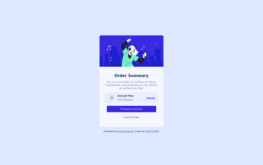
Design comparison
Solution retrospective
- The projects seem to be getting easier for me, I'm really happy at the fact that I've improved and I'm getting better although I still have a lot to learn.
- I'm still working on making my code as clean as possible so please I'm very open for feed back and suggestions
Community feedback
- @DavidMorgadePosted about 2 years ago
Hello and congratulations on finishing the challenge!, your component seems to be responsive and working properly, good job!
I noticed that in your
main
tag you are usingmargin
andmargin-inline
, both CSS styles are not necessary since you are already centering your component using flex in the main tag, if you want to separate the component with the attribution, just use amargin-bottom
.Also this attribution tag would fit perfectly in a
footer
tag instead of using adiv
! The rest of your html seems to have very good semantics, good job on that!To finish my feedback, I would recommend you to start using a methodology like BEM, it will help you organize your classes much better. In this project won't make a difference but for future projects, you can get a bit of a messy with your CSS classes and a naming convention will help you a lot!.
Hope my feedback helps you, good job!
Marked as helpful0 - @pradeeps4iniPosted about 2 years ago
Hi, @Tammy-Ajoko. How are you?
I'd like to give some suggestions, if you don't mind.
- To not repeat the same CSS. You can create utility classes. You're using
display: flex;
property on multiple elements. To not write it again and again, you can code a css class...
.flex { display: flex; }
and use it on the elements where you want to use flexbox.
-
We use alt texts to provide information about the image to the users of screen reader. We don't have to provide it on decorative images. For example: music icon. It's decorative image. It doesn't need alt text. You can leave it empty.
-
In the section2, you should give an inline-padding to the section and change the width of payment div from 270px to 100%. This way the buttons will be same as the other content in the section.
Have a fun day.:)
0 - To not repeat the same CSS. You can create utility classes. You're using
Please log in to post a comment
Log in with GitHubJoin our Discord community
Join thousands of Frontend Mentor community members taking the challenges, sharing resources, helping each other, and chatting about all things front-end!
Join our Discord