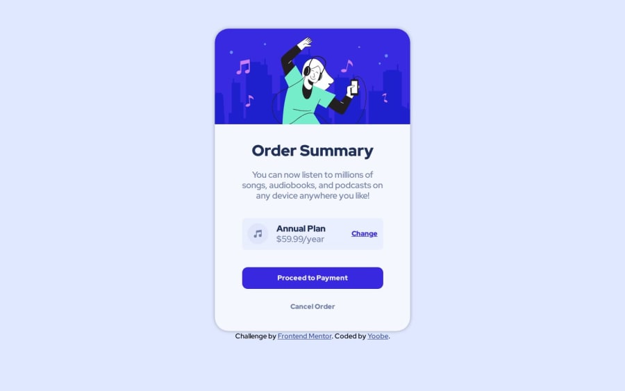
Design comparison
SolutionDesign
Solution retrospective
my code still messy how i can learn to be better, give me advice.Thanks
Community feedback
- @Mennatallah-HishamPosted about 1 year ago
Hi yoobezxc,
You did great 👍
Here are some suggestions to improve your code:
Comments
- leaving commented code in your code base is a bad practice
Accessibility
- add aria-hidden="true" to the icon, it is used to hide decorative content/images/icons from screen readers which improves their experience
SEO
- you can add meta description for better SEO, it provides a brief summary of a web page
<meta name="description" content="..........."/>Hope you find this helpful, Happy Coding
Marked as helpful1 - @sanju321GHPosted about 1 year ago
yo!, hi i think you forgot adding background image index.html- <img src="(image location)" alt="" style="position: absolute; left: 0%; top: 0%;">
you can also give the image style from style.css but the image doesn't have much of a style so i gave it inline style.
1@yoobezxcPosted about 1 year ago@sanju321GH Image was svg format i haven't quite mastered it yet. Thanks For Feedback
0
Please log in to post a comment
Log in with GitHubJoin our Discord community
Join thousands of Frontend Mentor community members taking the challenges, sharing resources, helping each other, and chatting about all things front-end!
Join our Discord
