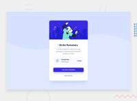
Design comparison
Solution retrospective
I'm new to Frontend development & learning it now. It will be a great help, if you could provide me the feedback on my solution. So I can improve the areas mentioned.
Thanks in advance.
by Kivi02
Community feedback
- @cwebdevPosted over 2 years ago
Hi Kivi02,
Congratulations on finishing your challenge! 🎉
I looked at your solution and here are few observations from my side:
- Add more metadata like description to describe what the page is about
- Add cursor pointer for buttons like "Proceed Payment" and "Cancel Order"
Hope this is helpful. 😁
Marked as helpful1@Kivi02Posted over 2 years ago@cwebdev Thanks for your valuable feedback, will work on the area you have mentioned.
1 - @denieldenPosted over 2 years ago
Hi Kivi, great work on this challenge! 😉
Here are a few tips for improve your code:
- to the body set
background-size: contain - add descriptive text in the
altattribute of the images - instead of using
pxuse relative units of measurement likerem-> read here
Overall you did well 😁 Hope this help!
Marked as helpful1@Kivi02Posted over 2 years ago@denielden Thanks for your valuable feedback. Will keep this on mind while working on my next challenge.
1 - to the body set
Please log in to post a comment
Log in with GitHubJoin our Discord community
Join thousands of Frontend Mentor community members taking the challenges, sharing resources, helping each other, and chatting about all things front-end!
Join our Discord

