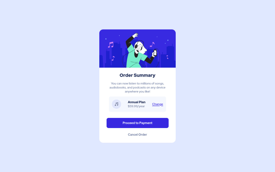
Submitted about 2 years ago
Order Summary HTML CSS
#web-components
@francescomerighi1202
Design comparison
SolutionDesign
Community feedback
- @0xabdulkhaliqPosted almost 2 years ago
Hello there 👋. Congratulations on successfully completing the challenge! 🎉
- I have other recommendations regarding your code that I believe will be of great interest to you.
BACKGROUND iMAGE 📸:
- Looks like the
background svgandcolorhas not been set, So let me explain How you can easily apply thebackground colorwith thesvgthey provided.
- Add the following style rule to your css, and then experience the changes
body {
    background: url(./images/pattern-background-desktop.svg), #E1E9Ff;
    background-repeat: no-repeat, no-repeat;
}
- Tip, Don't forget to generate a new screenshot after editing the
cssfile
COMPONENT MEASUREMENTS 📐:
- Use
min-height: 100vhforbodyelement instead ofheight: 100vh. Setting theheight: 100vhmay result in the component being cut off on smaller screens.
- For example; if we set
height: 100vhthen thebodywill have100vhheight no matter what. Even if the content spans more than100vh.
- But if we set
min-height: 100vhthen thebodywill start at100vh, if the content pushes thebodybeyond100vhit will continue growing. However if you have content that takes less than100vhit will still take100vhin space.
.
I hope you find this helpful 😄 Above all, the solution you submitted is great !
Happy coding!
Marked as helpful0@francescomerighi1202Posted almost 2 years ago@0xAbdulKhalid thanks for the advices!
0
Please log in to post a comment
Log in with GitHubJoin our Discord community
Join thousands of Frontend Mentor community members taking the challenges, sharing resources, helping each other, and chatting about all things front-end!
Join our Discord
