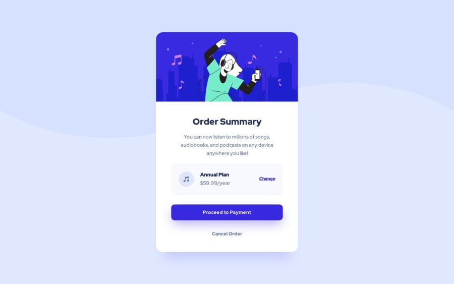
Design comparison
Solution retrospective
Would like to know on what I should improve, appreciate feedbacks!
Community feedback
- @OneManBannedPosted over 1 year ago
Hi Igor, very nice looking solution. A few bits of advice.
HTML
-
Very little to say here other than I think the change link would make more sense as a <button>. The <a> element is used to link to other webpages while the <button> element is used to trigger a JavaScript action. Here, I assume in fully working app pressing "change" would just change the details of the annual plan.
-
I also don't think you need an
alt=""tag on the image. Images that are purely decorative or are described in text nearby don't needalttags.
CSS
-
A little
margin-block: 2remon.containerwould push it away from the top and bottom. -
I would suggest not using
pxso much. Try relative units instead%,rem,em,vh,vw. They will help with responsive pages. -
Also try avoiding setting fixed heights on elements. Use padding and margin instead to reach the desired height. This also helps with responsiveness.
Well done, look really good.
Marked as helpful1@IgorDGomesPosted over 1 year ago@OneManBanned appreciate the feedback, i'll take it in mind for next projects!
Thank you for the help!
0 -
Please log in to post a comment
Log in with GitHubJoin our Discord community
Join thousands of Frontend Mentor community members taking the challenges, sharing resources, helping each other, and chatting about all things front-end!
Join our Discord
