


@elaineleung
Posted
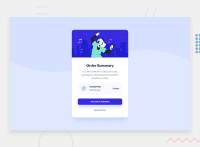
Hi Julian, well done here, especially in structuring the CSS! Things look very clean to me, and the component also looks good; I believe you just need some more padding in the content container (maybe try 1.5 or 2rem), and also add a bit of box shadow for the card, and that should get your card looking closer to the original.
About the CSS, I only got two thoughts here:
-
I see that you used a pseudo selector for the text in the your plan; I actually would have that in the main HTML because this is really important content info! If you look in the DOM inspector, you may only see the
::afterelement but not the actual text, and you'd want that to be visible for sure, especially for screen readers. What I would do is, I would have the text together in a container, and then just make sure they are both block elements so that they won't be inline. The HTML could look something like this:HTML: <div class="plan"> <h2>Annual Plan</h2> <span class="price">$59.99/year</span> </div> -
Right now I can only see the
box-sizingrule as the only normalize rule. You can try adding a few more rules, especially the margin and padding zero rules. Here are two I recommend on every project:* { margin: 0; padding: 0; font: inherit; } img, picture, video, canvas, svg { display: block; max-width: 100%; }
By the way, in the HTML, you got some issues in the report that you'll need to check out; most likely you'll need to add a main tag (most likely just below the body tag will do), and that should take care of most of the issues.
Great job on the whole, and keep going 😊
Marked as helpful
@JulianLivrone
Posted
@elaineleung
Hello Elaineleung, thank you for taking the time to review my solution to this challenge.
I learned a lot thanks to your feedback, I have just uploaded the solution with the changes and fixes. Keep the good work, you teached me a lot!
Greetings.
@elaineleung
Posted
@JulianLivrone No worries, glad to hear, Julian! 😊
