Design comparison
Solution retrospective
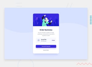
This is my first time using rem units. Worked great when scaling beyond 1400px, but for smaller design I was maybe expecting too much. I was imaging that changing the base font-size would make everything perfect, but I had to go and tweak everything.
What way would you recommend to minimize the lines of css that need to be written?
Community feedback
- @AgataLiberskaPosted almost 3 years ago
Hi Nicholas! So the problem with this approach is that when you set the font-size on the html tag, you take away the user's ability to change it in browser, making the content inaccessible for some. Also, on my screen, the card is really big, a lot bigger than I'd expect an element like this to be - and imagine if you had 3 of them within a page - no way they would all fit in without scrolling.
If you want to have fewer CSS lines, I'd recommend starting with mobile design - of course in this challenge, the layout doesn't change so you won't reap the benefits of it as much, but it really does help. Also, think about whether you need to apply certain styles at all. For example, your
.contentdiv is a flex container - but does it really need to be? The blocks in you markup are already on top of each other, you can just space them out with some padding/margin. Keep it simple :) You can also apply some global styles to avoid repeating yourself - for all anchor tags or whatever - again, this would be more useful for a more complex project than here but it's about the general approach: If you see certain elements of the same type sharing some styles - you can extract those into a separate class and apply to all those elements, with additional classes for properties they don't share.Hope this helps!
Marked as helpful0@tapzx2Posted almost 3 years ago@AgataLiberska thanks for the feedback!
Where would it be better to set the font-size?
Agreed! I was trying to answer the question: What should the background image do in this design beyond 1400px vw? I settled on scaling everything and... you're right it gets too big past a certain point. (2200px for me). I looked at a few other solutions and this was probably my favorite for this challenge: https://tahakhairy.github.io/order-summary-card/ and I like how you handled the pattern in this challenge: https://fylo-data-storage-liard-six.vercel.app/ Is there a standard practice on how to handle background patterns while still being true to the design?
I'll try the mobile first design next challenge and look for global styles. Thank you again!
0@AgataLiberskaPosted almost 3 years ago@tapzx2
I'd set it on the body using rem as the unit - and I would set it to the font size that most of the text in the design is at - then I don't have to declare it for most text separately, only if it deviates from the norm - another shortcut :)
And as for the background - I think it really depends on what the design is. In the solution you linked to for this challenge, if you set the body min-height to 100vh, and background-size to 100%, it's still quite close to the design I'd say. There will need to be some flexibility because different screens will have different height to width ratio. But if the design is calling for the background to stop exactly at 50% (0r 25%, etc.) of the container's height - like the Fylo challenge, or another example would be one of the pages in the Coffee Roasters website challenge - I go for a pseudoelement and add the background on that, this gives me more control so I can position it exactly where it needs to go :)
Marked as helpful0
Please log in to post a comment
Log in with GitHubJoin our Discord community
Join thousands of Frontend Mentor community members taking the challenges, sharing resources, helping each other, and chatting about all things front-end!
Join our Discord
