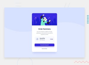
Design comparison
Solution retrospective
Is it just a matter of making a media query to make the font smaller when going from desktop to mobile? was trying to size the p section too decided to leave as is for now. any tips welcome!
Community feedback
- @willettoPosted almost 2 years ago
Hey Morgan! Overall, great job, especially for week one! I noticed a few easy fixes that should help this match even more, and hopefully help you on other challenges.
-
Make sure the font colors and weights match the design. What looks like black is actually a very dark blue. If you look in the
style-guide.mdthat came with the project, it will list out the colors. If you haven't used a color or font-weight by the end of the challenge, it probably means you missed it. Like a leftover puzzle piece. 😂 -
You're on the right track with media queries. I don't think the
text-sizechanges, but the padding does. For the mobile view, left and right padding are25px, but at desktop size it's50px. I am on a Mac and open the design images in preview and just measure there. -
Space between elements. You have great spacing with the header tag, but the short paragraph and buttons are smushed together. I like to add only
margin-bottomto my elements, so I have to do less math.
This might be a bit much, but the code I used was:
.order-summary *:not(:last-child) { margin-bottom: 20px; }The bottom half of my card had a class of
order-summary, the*means all children in that div, and:not(:last-child)excludes theCancelbutton. So everything from the header to the buttons gets 20px of spacing between it.Hope that's helpful!
0 -
Please log in to post a comment
Log in with GitHubJoin our Discord community
Join thousands of Frontend Mentor community members taking the challenges, sharing resources, helping each other, and chatting about all things front-end!
Join our Discord
