Design comparison
Solution retrospective
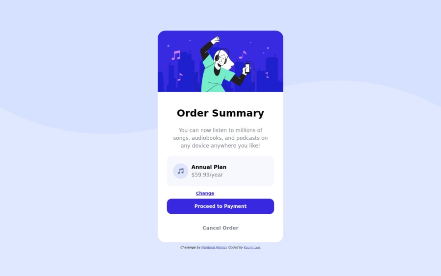
I think the margin-top of the white-card is off lol. If you do agreed, please tell me how I can fix it.
Coding a project is very time consuming, but overall, I think I did well throughout this entire project. However, I still think I have more to learn from this projects and for future projects I might take on.
Please feel free to review my HTML & CSS code. Any feedbacks and comments are welcome ;-D
Community feedback
- @AdrianoEscarabotePosted about 2 years ago
Hi KL, how are you?
I really liked the result of your project, but I have some tips that I think you will enjoy:
To prevent the background image from breaking at higher resolutions, we can prevent this in two different ways:
-
Add a
background-repeat: repeat-x;, the image will repeat on the horizontal axis, preventing it from breaking. -
Add a
background-size: 100% 50vmin;, the50vminwill set its height as the page target, and100%will make it stretch on the horizontal axis.
Feel free to choose one of the two!
The rest is great!
I hope it helps... 👍
2 -
Please log in to post a comment
Log in with GitHubJoin our Discord community
Join thousands of Frontend Mentor community members taking the challenges, sharing resources, helping each other, and chatting about all things front-end!
Join our Discord
