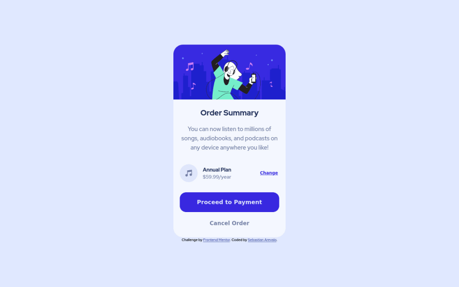
Order summary component with vanilla HTML, CSS.
Design comparison
Solution retrospective
Always happy with feedbacks :)
Community feedback
- @vanzasetiaPosted over 2 years ago
Hi, Sebastian! 👋
Nice solution! It's great that you are using the
mainelement to wrap the card content. It's also a good thing that you are wrapping all the interactive elements with interactive elements, in this case, withbuttonelements.However, I have two things that I would like to suggest,
- Firstly, I would recommend fixing all the accessibility issues that have been reported by Frontend Mentor. Having an accessible is one of the most important things that you need to consider as a frontend developer. You could click the Learn More link to get more information about the issue and how to solve it.
- Second, I would suggest specifying the
typeof anybuttonelements. By doing that, you will prevent thebuttonfrom behaving unexpectedly, like submitting. In this case, you can specify the type of them astype="button".
Overall, you have done a great job with the HTML markup and I think if you fix all the accessibility issues, it would make your website more accessible to more people, especially for the people who rely on assistive technology. 😉
That's it! Hope you find this useful! 😁
Marked as helpful2 - @denieldenPosted over 2 years ago
Hi Sebastian, I took some time to look at your solution and you did a great job!
Also the top background image is broken because the url is incorrect, fix it like this:
background-image: url(../assets/images/pattern-background-desktop.svg);to body and try to add a littletransitionon the element with hover effectOverall you did well 😉 Hope this help
Marked as helpful1 - @AbdoArafhPosted over 2 years ago
- You can make Order summary bold
- don't set a
max-widthon theimgawidth: 100%would be a good idea in your case - the lower part of the card needs more padding
- the annual plan part needs a background color
- Please, Don't have a set width on the card it self or just increase it
Overall the design looks fantastic. I hope you do even better next time ;)
1
Please log in to post a comment
Log in with GitHubJoin our Discord community
Join thousands of Frontend Mentor community members taking the challenges, sharing resources, helping each other, and chatting about all things front-end!
Join our Discord
