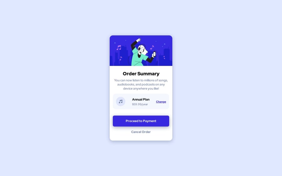
Design comparison
Solution retrospective
I'm definitely getting more comfortable with the layouts! Two questions I need help with please:
-
How do I create the background with the curves?
-
Is there a better way to handle the image border radius? I feel I'm duplicating the rounding on the image but it doesn't inherit the shape from the container and
overflow: hidden;doesn't seem to make a difference.
Any other feedback to make my code better would be highly valued!
Thank you! Kate
Community feedback
- @MaximilianoDanielGarciaPosted over 1 year ago
Hi Kate, great job!
You're right. It is not necesary duplicate the rounding on the image. Just add
overflow:hiddenon your.card-containerclass.Marked as helpful0@funficientPosted over 1 year agoThanks @MaximilianoDanielGarcia !
So I was on the right track, I just tried it on the child and not the parent. Tried it and it works. Thank you!
0 - @blackdreamer15Posted over 1 year ago
Hey, @funficient! Great work out there.
You do not actually need to create that illustration. It is part of the assets. In case you do not have those, The link below refers you to my GitHub where you can get those assets:
pattern-background-desktop.svgandpattern-background-mobile.svg.Best of luck! 😊
Marked as helpful0@funficientPosted over 1 year agoThanks @blackdreamer15 Silly me! I thought I had to create it myself with CSS.
0
Please log in to post a comment
Log in with GitHubJoin our Discord community
Join thousands of Frontend Mentor community members taking the challenges, sharing resources, helping each other, and chatting about all things front-end!
Join our Discord
