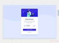
Design comparison
Solution retrospective
Hi all, this is my solution to the order summary component challenge.
I managed to use media queries to specify display for small and large screens.
Any and all feedbacks is welcomed...
Community feedback
- @eddybproPosted over 1 year ago
Hi, Blackysynch
Congratulation on finishing this challenge, I hope it was fun.
Here are some suggestions that might improve the code:
- CSS code:
@media only screen and (min-width: 376px)
.card {
background-color: white;
/* remove this line: height: 80%; */
/*  remove this line: min-width: 30%; */
/*update this*/
max-width: 25rem;
}
.plan{
/*remove this line: justify-content: space-between;*/
/*add this line*/
background-color:/*your color*/
}
Tip
Remember to start using relative values
rem eminstead of absolute valuespx.That's it HAPPY CODING
Marked as helpful0@BlackysynchPosted over 1 year agoThanks @eddybpro
this was very helpful.
Do you have recommendations for resources on css units?
0@eddybproPosted over 1 year agoHello, @Blackysynch
I'm happy that you find my suggestions useful.
For the CSS units here are some resources:
GOOD LUCK IN YOUR JOURNEY
0
Please log in to post a comment
Log in with GitHubJoin our Discord community
Join thousands of Frontend Mentor community members taking the challenges, sharing resources, helping each other, and chatting about all things front-end!
Join our Discord

