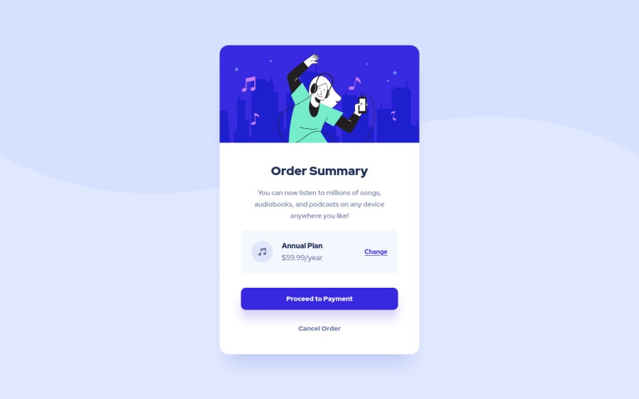
Design comparison
Solution retrospective
I would appreciate any feedback...
Community feedback
- @Enmanuel-Otero-MontanoPosted over 2 years ago
Hello Rodrigo! Congratulations for your solutions.
Your design and your solution are fine, but I would like to make a suggestion.
You could change the div with the "card" class or the div with the "card__container" class for a section tag, in this way your code would be more semantic, which would bring you more benefits in terms of search engine positioning in a real project and a better user experience in terms of accessibility.
Cheers.
Marked as helpful0@s0alkenPosted over 2 years ago@Enmanuel-Otero-Montano I updated my solution, thanks for your feedback!
1
Please log in to post a comment
Log in with GitHubJoin our Discord community
Join thousands of Frontend Mentor community members taking the challenges, sharing resources, helping each other, and chatting about all things front-end!
Join our Discord
