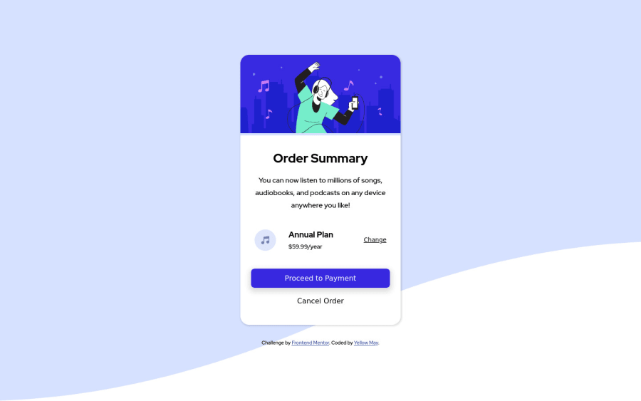
Order Summary Component with mobile first CSS
Design comparison
Solution retrospective
Open to Feedbacks
Community feedback
- P@brodiewebdtPosted over 3 years ago
as @meladcodes said every page should have an H1 for accessibility reasons. You shouldn't skip heading levels. You can style them to look however you want. Change the attribution div to a Footer and those things will clear the accessibility warnings.
Download AXE DevTools and you can clear accessibility warnings while you code. https://www.deque.com/axe/devtools/
Hope this helps.
Marked as helpful1 - @meladcodesPosted over 3 years ago
Hi, in order to avoid accessibility issues in the future:
- wrap everything in your body in <main>
- start your headings with h1 and move up by one level each time
Hope this helps!
0@anoshaahmedPosted over 3 years ago@meladcodes you've been copy-pasting the exact same comment i posted
0
Please log in to post a comment
Log in with GitHubJoin our Discord community
Join thousands of Frontend Mentor community members taking the challenges, sharing resources, helping each other, and chatting about all things front-end!
Join our Discord
