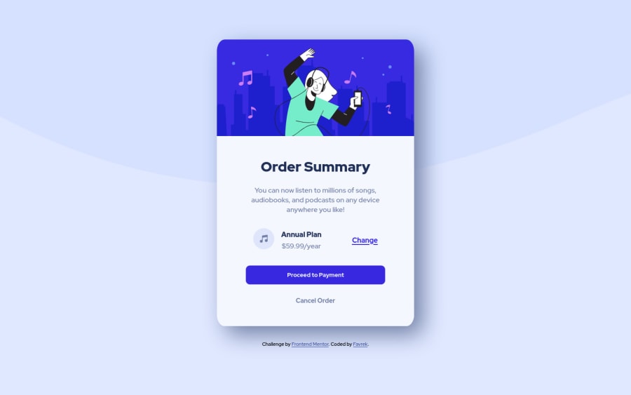
Design comparison
SolutionDesign
Solution retrospective
Hello everyone, any feedback is welcome!
Community feedback
- @denieldenPosted almost 3 years ago
Hi Favrek, I took some time to look at your solution and you did a great job!
Also I have some tips for improving your code:
- add
maintag and wrap the card for Accessibility - remove all
marginfromwrapperclass because with flex they are superfluous - use flexbox to the body for center the card. Read here -> best flex guide
- after add
min-heigth: 100vhto body because Flexbox aligns to the size of the parent container - try to add a little
transitionon the element with hover effect - For fix the top image in the background just put more specific background properties to the body:
background: url("../img/pattern-background-desktop.svg") no-repeat top center;
background-size: contain;
background-color: #e0e8ff;
Overall you did well :)
Hope this help and happy coding!
Marked as helpful1 - add
- @NaveenGumastePosted almost 3 years ago
Hello Favrek ! Congo 👏 on completing this challenge ,
Let's look at some of your issues, shall we:
-> Accessibility Issues occur due to lack semantic elements in the HTML Learn Semantic Elements
->
background-size: cover;Here i would prefer "contain" over "cover"-> Overall you code is clean
happy Coding😀
Marked as helpful1
Please log in to post a comment
Log in with GitHubJoin our Discord community
Join thousands of Frontend Mentor community members taking the challenges, sharing resources, helping each other, and chatting about all things front-end!
Join our Discord
