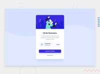
Design comparison
Solution retrospective
I was so new to web development here..any corrections would be needed since I didn't update the code lol
Community feedback
- @correlucasPosted about 2 years ago
👾Hi Daniel , congrats on completing this challenge!
I've just opened your live site and I can say that you did a great job putting everything together! There's some tips to improve your solution:
The background wave image is missing and here’s the step-by-step to add it.First of all add the image as a background inside the
bodythis is the code for that:background-image: url(../images/pattern-background-desktop.svg);Then you add
background-repeat: no-repeatto avoid the background repeating andbackground-size: containto make it fit full width and center with the card this is the best choice, but an alternative to resize it is to usebackground-size: 125%,body { background-image: url(./images/pattern-background-desktop.svg); /* background: hsl(225, 100%, 94%); */ background-repeat: no-repeat; /* background-position: center; */ background-size: contain; background-color: hsl(225deg 100% 97%); }✌️ I hope this helps you and happy coding!
Marked as helpful0
Please log in to post a comment
Log in with GitHubJoin our Discord community
Join thousands of Frontend Mentor community members taking the challenges, sharing resources, helping each other, and chatting about all things front-end!
Join our Discord

