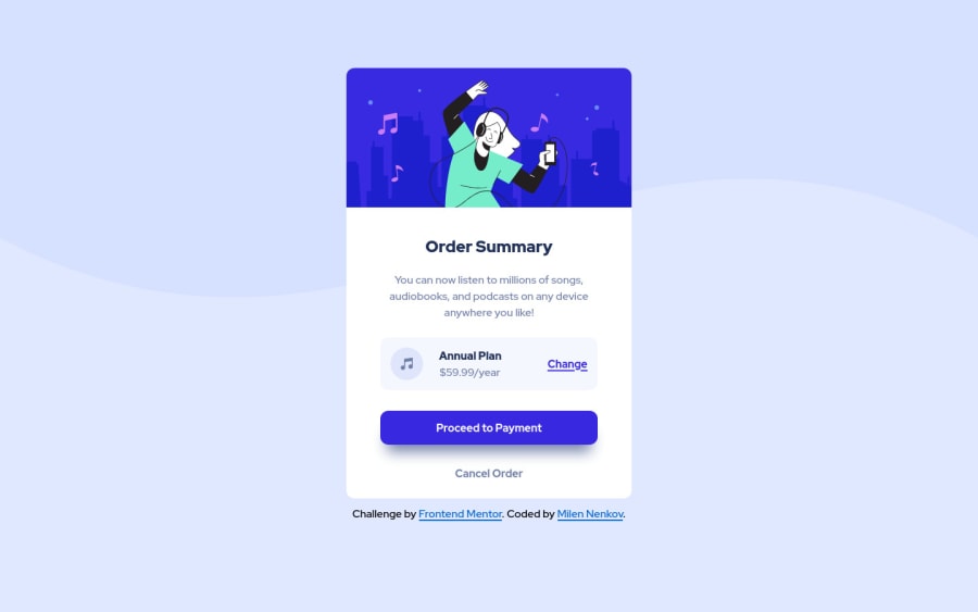
Order Summary Component with Flexbox and Grid - First Challenge
Design comparison
Solution retrospective
Hello all, This is my first ever project outside of a tutorial. I would appreciate any pointers, advice or full blown constructive criticism you might have for a budding newbie web dev. Thank you and until we meet again. Best Regards Milen
Community feedback
- @chetanhaobijamPosted about 3 years ago
Great job, @milen-nenkov. I would suggest to increase the font-size of the Heading "Order Summary" a bit to match the design. And use html5 semantic elements such as header, main, section, article, footer, etc. instead of usual divs to fix the html accessibility issues in your website. Keep on coding... Chetan.
Marked as helpful1@milen-nenkovPosted about 3 years agoThank you for the feedback @chetanhaobijam. I updated the code to factor in the accessibility issues you pointed out.
0 - @RobertK0Posted about 3 years ago
I'm no pro myself, but I think the grid and flex box were well used. The only thing I would advise is to try playing out with centering the "wrapper" vertically on the page, instead of going around that by using a fixed margin-top. Other than that, well done!
1
Please log in to post a comment
Log in with GitHubJoin our Discord community
Join thousands of Frontend Mentor community members taking the challenges, sharing resources, helping each other, and chatting about all things front-end!
Join our Discord
