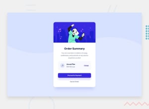
Design comparison
Community feedback
- @purplehippo911Posted over 2 years ago
Hi @mzs21 and congratulations for finishing this challenge.
You should check the "README.md" you should have got when you downloaded the files for this challenge. In that README.md file it says which colors and fonts that were used for this challenge. I think you should check it out because some of the colors on for example your "proceed to payment"-button is blue, which it should`nt be.
Dont use fixed widths on the ".card" because that makes it smaller on bigger screens. Using a "min-width" and a "max-width" makes it so that the card can adjust it self to the screen size while staying in the minimum and the maximum width that was specified. For example:
.card { min-width:18rem; max-width:25rem; }- And I would suggest you to increase the "border-radius" to the ".card" a bit more
And remember to update the preview of your solution by clicking the "generate screenshot"-button under the "design comparison".
And lastly I think you did a great job at this and I liked your creative footer. Happy Coding!!🎈🎆
Marked as helpful0@mzs21Posted over 2 years ago@purplehippo911 Thanks for your suggestion.
0
Please log in to post a comment
Log in with GitHubJoin our Discord community
Join thousands of Frontend Mentor community members taking the challenges, sharing resources, helping each other, and chatting about all things front-end!
Join our Discord
