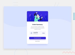
Design comparison
Solution retrospective
Feedback will be appreciated
Community feedback
- @Juveria-DalviPosted about 3 years ago
Hey well done..✅ instead of <section> wrap in <main> so that it won't give any accessibility issue
Marked as helpful2 - @grace-snowPosted about 3 years ago
Hello
max-height: 85%;breaks this for me as the content get's cut off. You shouldn't need a height on main at all.The other thing that is causing it to break, even after removing the height limit is the way you are centering it on the page. Position absolute with transform translate is a really bad method for this as it takes all of your content outside of the document flow and pins it to the center, no matter what the screen size and disabling scroll.
Instead, use flexbox or css grid to center your component on the page.
I think you're getting confused between margin and padding on this too. Padding is for inside boxes - like in the white area of the card (this should have one wrapper element around it all), use padding in rem to make sure content is spaced from the edges of the card. Margin is for creating space between elements, like the vertical space between heading and paragraph. At the moment all the widths and margins on this are causing overflow on all sorts of elements. I recommend removing every margin in % and only using margin/padding/max-width in rem units on this.
In HTML
- Remove header - this is just an image on a card, and arguably a decorative image, so that definitely doesn't deserve to be a header. Also, header should not sit inside main.
- Alt text must always be a human readable description, not a hyphenated text string. And only needed if it is a meaningful image. If a decorative image or not important to the content of the page, leave blank on purpose like
alt="" - Don't use the
<b>element. It is deprecated - Annual plan should be a heading
- Optional, but in my opinion 'Change' should be a button. I think it would perform an action, like toggling price to monthly, not trigger navigation
- Again, proceed and cancel sound like they would trigger navigation, not perform an action - so I would make those into anchor tags
- It's really important to include focus-visible styles on every interactive element to make sure the focus is clearly visible to keyboard users
These are all really common issues that takes everyone a while to get used to, so don't get discouraged by this feedback.
I hope this helps you and you keep enjoying learning front end.
Marked as helpful0@Tomi-pterPosted about 3 years ago@grace-snow Thanks for the feedback. I've carried out all the necessary corrections (i.e all corrections excluding change/proceed/cancel button/anchor re-assigning). Thank you so much for this cos it has really helped me understand positioning and size units. I really really appreciate 👏👍.
0@grace-snowPosted about 3 years ago@Tomi-pter what do you think Change, proceed and cancel would each do?
0@Tomi-pterPosted about 3 years ago@grace-snow i agree with you on what their functions would be.
0@grace-snowPosted about 3 years ago@Tomi-pter so that means the elements need to change. Buttons are for actions (eg change triggers a toggle) and anchor tags are for navigation (eg proceed/cancel take user to other places). This is extremely important to grasp, it affects assistive tech users understanding of a page
Also, make sure headings go in order and remove any inline styles in html. The annual plan heading looks like it's jumped heading levels (again, important for accessibility and search engines)
0
Please log in to post a comment
Log in with GitHubJoin our Discord community
Join thousands of Frontend Mentor community members taking the challenges, sharing resources, helping each other, and chatting about all things front-end!
Join our Discord
