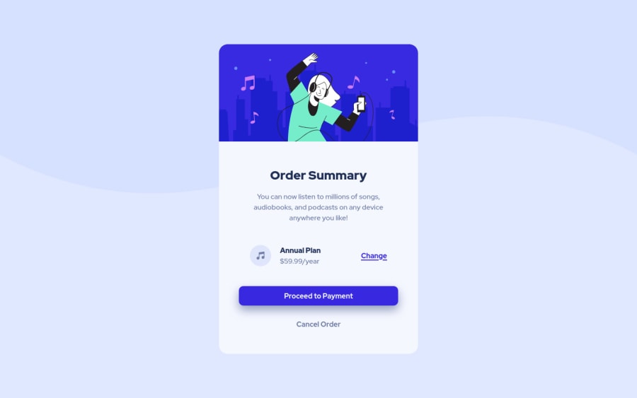
Design comparison
Solution retrospective
This is my 6th Frontend Mentor Challenge... Any suggestion???
Community feedback
- @correlucasPosted over 2 years ago
👾Hello PVI, congratulations for your new solution!
Your solution is just great, the only thing I think you can improve is to add
min-height: 100vh;instead ofmin-height: 709px;to make the body display the background fullheight.See the code changes I did for you below:
.main {
    min-height: 100vh;
    background-image: url(../images/pattern-background-mobile.svg);
    padding: 0 25px;
}
👋 I hope this helps you and happy coding!
Marked as helpful1@PVIdubsPosted over 2 years ago@correlucas Thank You So Much... I noticed that bug and just now I was fixing it... but I have a question: I should leave min-height: 900px; in the desktop version??? Is there a better solution??? Because otherwise the main element would have the height of the card...
Once again thank you for your comment
0@PVIdubsPosted over 2 years ago@correlucas Thank You So Much... I noticed that bug and just now I was fixing it... but I have a question: I should leave min-height: 900px; in the desktop version??? Is there a better solution??? Because otherwise the main element would have the height of the card...
Once again thank you for your comment
1@correlucasPosted over 2 years ago@PVIdubs For the container
heightyou don't really need to set it, the height comes from the element and its paddings, its an automatic size, the problem with height is that if the content grow more than the height this make the content pop out the container.Marked as helpful1@PVIdubsPosted over 2 years ago@correlucas Ok, I understand it now... Thanks for your help and happy coding too...
0
Please log in to post a comment
Log in with GitHubJoin our Discord community
Join thousands of Frontend Mentor community members taking the challenges, sharing resources, helping each other, and chatting about all things front-end!
Join our Discord
