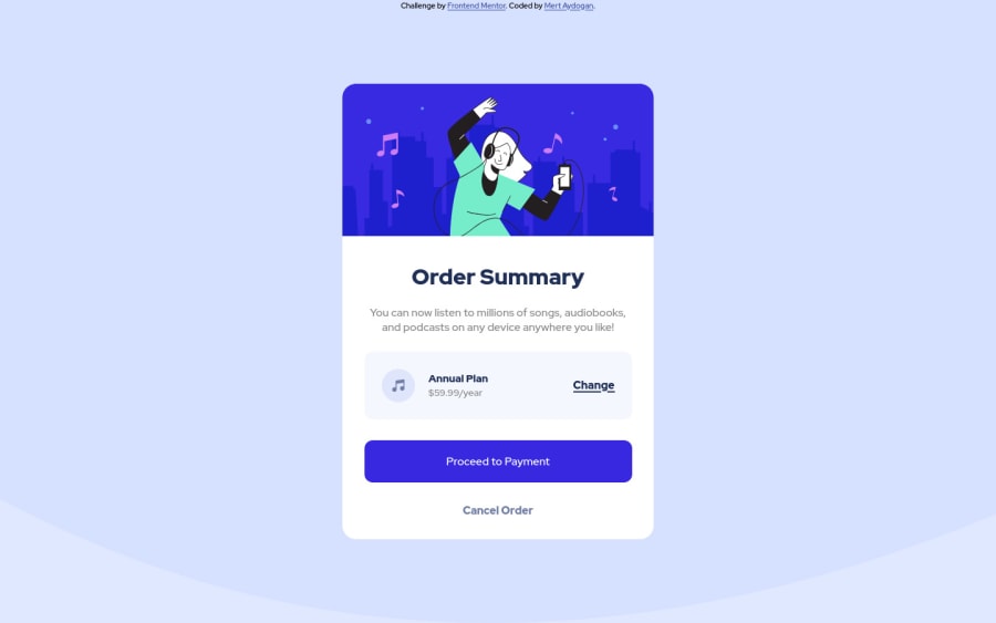
Design comparison
Community feedback
- @HassiaiPosted almost 2 years ago
Replace<div class="container">with the main tag and <div class="attribution"> with the footer tag to fix the accessibility issues. for more on semantic html visit https://web.dev/learn/html/semantic-html/
Change the value of the background-size to contain.
To center .container on the page, add min-height:100vh; display: flex; align-items: center: justify-content: center; or min-height:100vh; display: grid place-items: center to the body.
You forgot to ad a box-shadow to .proceed-btn.
Use rem or em as unit for the padding, margin, width and preferably rem for the font-size for more on CSS units watch this https://youtu.be/N5wpD9Ov_To
Hope am helpful.
Well done for completing this challenge. HAPPY CODING
0
Please log in to post a comment
Log in with GitHubJoin our Discord community
Join thousands of Frontend Mentor community members taking the challenges, sharing resources, helping each other, and chatting about all things front-end!
Join our Discord
