Design comparison
Community feedback
- @NatalyHalouchykPosted about 3 years ago
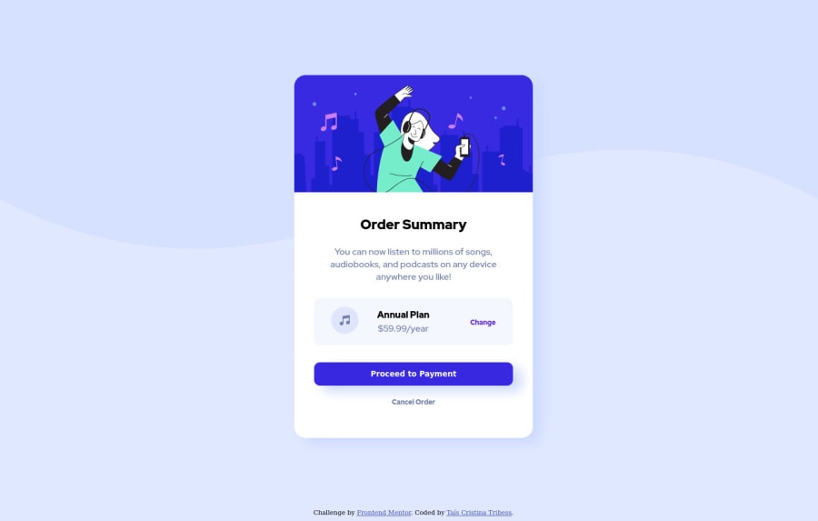
Hello! To get the proper background try to add on your CSS page insige "body" selector : background-repeat: no-repeat; /to avoid the repetition of the image/ background-color: hsl(225, 100%, 94%); /to make the bottom half be colorful, not just white/
Marked as helpful1@tctribessPosted about 3 years ago@NatalyHalouchyk Hello! Thank you Nataly. Helped me a lot!
0 - @akshaywebsterPosted about 3 years ago
Hi, Tais!
Good job with the challenge.
A couple of things that I noticed:
Your card is not properly centered both vertically and horizontally, you've used a hard margin-top: 16vh to push the card a bit down from the top.
The background image isn't occupying the entire width of the screen, I guess
background-size: contain;will fix the issue for you.Try to add box-shadow to your card as well.
Hope my feedback helps! Have a great day!
Marked as helpful0@tctribessPosted about 3 years ago@akshay1337 Hello! Thanks for your feedback.
I tried applying background-size: contain; but doesn't worked well.
I used the property background-repeat: no-repeat; (useful to solve my problem with background in the end of the page). When I remove this property it solves the background problem on the right side.
I applyed display flex to solve the problem of centralization and applyed the box-shadow on the main-card.
Thanks a lot!
0
Please log in to post a comment
Log in with GitHubJoin our Discord community
Join thousands of Frontend Mentor community members taking the challenges, sharing resources, helping each other, and chatting about all things front-end!
Join our Discord
