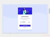
Design comparison
Solution retrospective
Hello guys, I just completed this challenge. Please kindly review and let me know where I can improve on. Thanks.
Community feedback
- @vanzasetiaPosted over 2 years ago
Hi, Mhizdhee! 👋
Good effort on this challenge! 👍
I have a few suggestions for this solution.
- As you may already know that the card is bigger than the original design. So, I would recommend trying to adjust the styling of the card. You don't need to make it to be "pixel-perfect". As long as it looks similar then it's would be good. 🙂
- I notice that there's no background color and background image on screen sizes that are bigger than
1440px. I would recommend keeping both on any screen sizes.
I highly recommend writing the styling using the mobile-first approach. So, instead of using
max-widthmedia queries, you will usemin-widthmedia queries instead. It often leads to shorter and better performance code. Also, mobile users won't be required to process all of the desktop styles.I hope this helps! 👍
Marked as helpful0 - @mubizzyPosted over 2 years ago
Excellent job on this challenge! your report has a few issues though:
- wrap everything in your body in
<main>or use semantics
2. it is a best practice to use both HTML 5 and ARIA landmarks to ensure all content is contained within a navigational region.
Hope it helps:)...don't forget to mark it as helpful 👍
You can get more details here...click here
0 - wrap everything in your body in
- @MhizdheePosted over 2 years ago
Hello Vanza,
Thanks so much for this feedback. It was really helpful. I learnt a lot while working on the responsiveness. Thank you.
0
Please log in to post a comment
Log in with GitHubJoin our Discord community
Join thousands of Frontend Mentor community members taking the challenges, sharing resources, helping each other, and chatting about all things front-end!
Join our Discord

