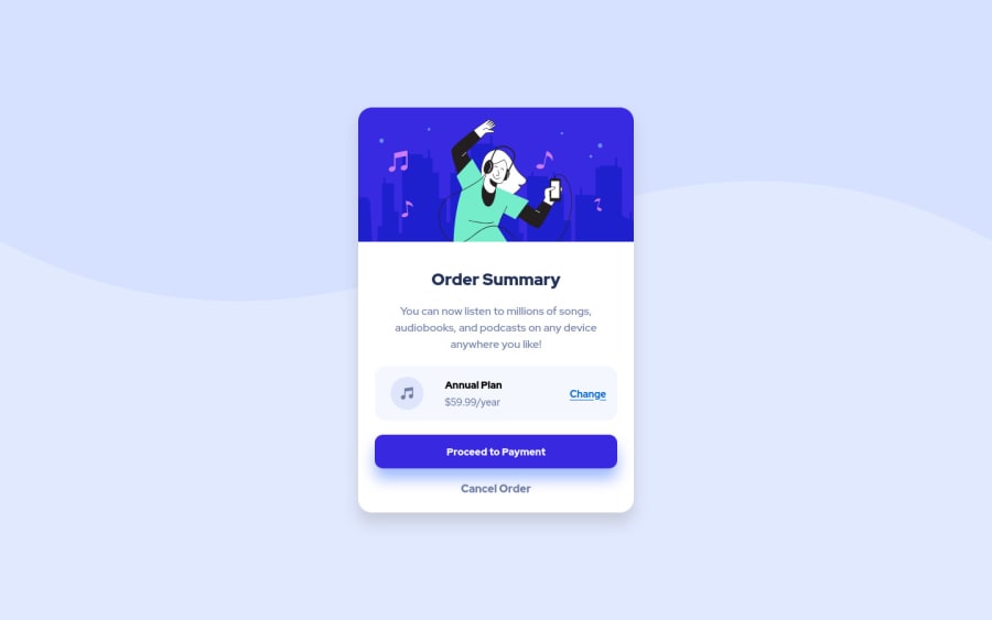
Order Summary Component using Next.js, Typescript and SASS
Design comparison
Solution retrospective
Is there a better way to set the background to that it auto-resizes properly as the window size changes? Is there anything noticeably out of place? Is it responsive enough?
Community feedback
- @correlucasPosted about 2 years ago
👾Hello Anthony Y, Congratulations on completing this challenge!
Great solution and great start! By what I saw you’re on the right track. I’ve few suggestions to you that you can consider to add to your code:
Your component is perfect, but is not responsive yet, this is due the
fixed widthyou've applied to the container.Look both
widthandmax-widththe main difference between these properties is that the first(width) is fixed and the second(max-width) isflexible, for example, a component withwidth: 340pxwill not grow or shrink because the size will be ever the same, but a container withmax-width: 340pxormin-width: 340pxcan grow or contract depending of the property you've set for the container. So if you want a responsive block element, never usewidthchoose ormin-widthormax-width.Note that there's no need to use
heighthere, because since you set aheightfor an element, this means that this element will grow until a certain point and after that the inner content (as texts or images) will start to pop out the element due its fixed height, so isn't necessary to set theheightthe container height comes from the elements, its paddings and height.✌️ I hope this helps you and happy coding!
Marked as helpful1
Please log in to post a comment
Log in with GitHubJoin our Discord community
Join thousands of Frontend Mentor community members taking the challenges, sharing resources, helping each other, and chatting about all things front-end!
Join our Discord
