Design comparison
SolutionDesign
Solution retrospective
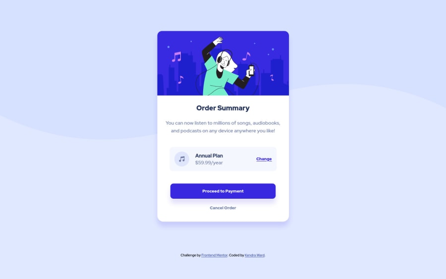
Here is my solution for the order summary component. I'm pretty happy with the design. However, I noticed when the screen goes to 1440px, the desktop image flattens out at the bottom on the left side of the page. I spent a week trying to fix it and I Have no idea how to do so. If anyone can help that would be most appreciated. Happy coding!
Community feedback
Please log in to post a comment
Log in with GitHubJoin our Discord community
Join thousands of Frontend Mentor community members taking the challenges, sharing resources, helping each other, and chatting about all things front-end!
Join our Discord
