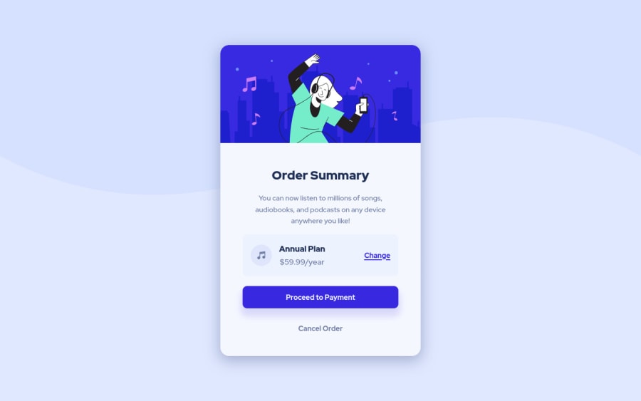
Order Summary Component using HTML, CSS and Flexbox
Design comparison
Solution retrospective
I struggled a lot more than I thought I would with the background image. I got there eventually, but I'm still not sure it's correct. It's difficult to tell from looking at the design pictures. It seems like it still needs to be shifted slightly higher?
I'm still not quite comfortable developing for mobile though. According to the mobile design picture, there seems to be a gap between the card and the edge of the screen. Is it correct to add a margin once the page size reaches a certain limit (500px in my case)? Or is there another method I could use?
For the next challenges, I'll try to develop mobile first. I'm currently developing desktop first and then changing things to fit the mobile design.
Thanks for the help!
Community feedback
Please log in to post a comment
Log in with GitHubJoin our Discord community
Join thousands of Frontend Mentor community members taking the challenges, sharing resources, helping each other, and chatting about all things front-end!
Join our Discord
