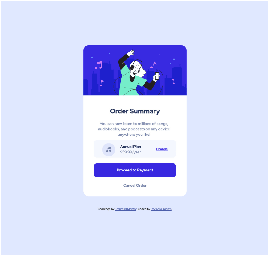
Order Summary Component using HTML, CSS and flexbox
Design comparison
Solution retrospective
This is my second project from front-end mentor challenges and I have done it as close to the design as possible, so if anyone has some suggestions to improve the code and design code then I am very grateful for the valuable feedback.
Community feedback
- @denieldenPosted almost 3 years ago
Hi Ravindra, great work on this challenge! 😉
Here are a few tips for improve your code:
- add
maintag and wrap the card for improve the Accessibility - For add the top image in the background just put more specific background properties to the
.containerclass:
background: url("../img/pattern-background-desktop.svg") no-repeat top center; background-size: contain; background-color: #e0e8ff;- not use
h4insidebuttonelement - remove all
marginfrom.summaryContainerclass because with flex they are superfluous - set
min-height: 100vhto.containerclass insteadheight - add
transitionon the element with hover effect - instead of using
pxuse relative units of measurement likerem-> read here
Overall you did well 😁 Hope this help!
Marked as helpful0 - add
- Account deleted
Hi there,
-
remove all the flex properties and background-color and add it to the body
-
give the body min-height:100vh: also remove the height from the container
-
add tranistion:1s; to the button so that when you hover on the button the background changes smoothly
-
check the HTML report to fix accessiblity issues
i hope this is helpful and goodluck!
Marked as helpful0 -
Please log in to post a comment
Log in with GitHubJoin our Discord community
Join thousands of Frontend Mentor community members taking the challenges, sharing resources, helping each other, and chatting about all things front-end!
Join our Discord
