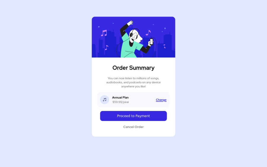
Design comparison
Solution retrospective
Please provide feedback on how to improve my site. :)
Community feedback
- @pikapikamartPosted over 3 years ago
Hey, awesome work on this one. Layout in general looks great just needed for it a bit taller. Also the site right now doesn't respond well on mobile sizes, if you go to like 400px, you will see that the contents are being hidden by the screen and creating horizontal scroll.
MikevPeeren already gave great suggestion on this one, just going to add some suggestions as well:
- When you are deploying into github, make sure that your path for your images or files doesn't use the root path
/because that won't work in github. For the background-circles to appear, you should use this value instead on thebackgroundfor thebodytagurl(./images/pattern-background-desktop.svg). - Use
background-size: 100%instead ofcoverso that it will fit nice. - It would be great to have a base styling of this:
html {
  box-sizing: border-box;
  font-size: 100%;
}

*,
*::before,
*::after {
  box-sizing: inherit
}
This way, handling an element specially its size will be easier because of the
box-sizing- Always have a
mainelement to wrap the main content of the site. For this usemaintag on the.containerselector. - Just to clarify what Mikey said about the images. When an image on the site is only acting as a decoration and not really adding any information or content to the site, you usually hide those elements for screen-reader users using
alt=""andaria-hidden="true"if you are usingimgtag, but if you are usingsvg, just usearia-hidden="true". - For now, you can use
h1on theorder summarytext since anh1is needed on the site. But if you insist on usingh2on it, then create a screen-reader onlyh1on the site. Have a look at Vanza's solution on this challenge inspect the layout and see the usage ofh1as well the stylings applied to it. - The music-icon is only decorative so hide it using the method I mentioned above.
- When using
imgtag, you don't need to add words that relates to "graphic" such as "icon, image" and others, sinceimgis already an image so no need to describe it as one. - The
annual-planshould be using eitherh2orh3but noth4. Do not skip a level of a heading tag. - Lastly, try to make the site as responsive as you can. If you are using
widthprops, maybe you should change it tomax-widthso that the element won't have a fixed width and will let the element resize if needed.
Aside from those, great job again on this one.l
Marked as helpful2 - When you are deploying into github, make sure that your path for your images or files doesn't use the root path
- @MikevPeerenPosted over 3 years ago
Hey 👋
Try to start headers with h1 rather than h2 and then increment by 1. Also leave alt text for images empty when they add nothing to screen readers also on mobile the component reaches the edge of the screen a margin or padding would solve this problem.
I am also missing the background image 😢
But for the rest good job 👏
Marked as helpful1
Please log in to post a comment
Log in with GitHubJoin our Discord community
Join thousands of Frontend Mentor community members taking the challenges, sharing resources, helping each other, and chatting about all things front-end!
Join our Discord
