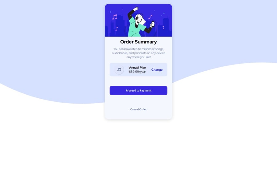
Order summary component using HTML and CSS
Design comparison
Solution retrospective
I’m most proud of the aesthetic appeal and user-centric design of the order summary component. It was a great opportunity to apply design principles and create something visually pleasing. If i were to do it differently next time, i would experiment with different design patterns and seek more diverse feedback to enhance the design even further.
What challenges did you encounter, and how did you overcome them?One of the challenges i encountered was aligning the background image with the card layout. The image was not positioned correctly, which detracted from the design’s visual impact. To resolve this, I adjusted the padding on the image. This approach not only fixed the alignment issue but also provided a cleaner and more controlled layout. It was a valuable lesson in using CSS properties effectively to enhance design elements and improve user experience.
What specific areas of your project would you like help with?I would appreciate assistance in improving the semantic structure of my HTML. Ensuring that the markup is clear and meaningful will not only enhance accessibility but also make the codebase more maintainable. Additionally, I’m eager to learn more advanced CSS techniques. Gaining a deeper understanding of CSS will enable me to create more sophisticated and responsive designs. Any resources or guidance on this topic would be highly beneficial.
Community feedback
Please log in to post a comment
Log in with GitHubJoin our Discord community
Join thousands of Frontend Mentor community members taking the challenges, sharing resources, helping each other, and chatting about all things front-end!
Join our Discord
